Essential redesign
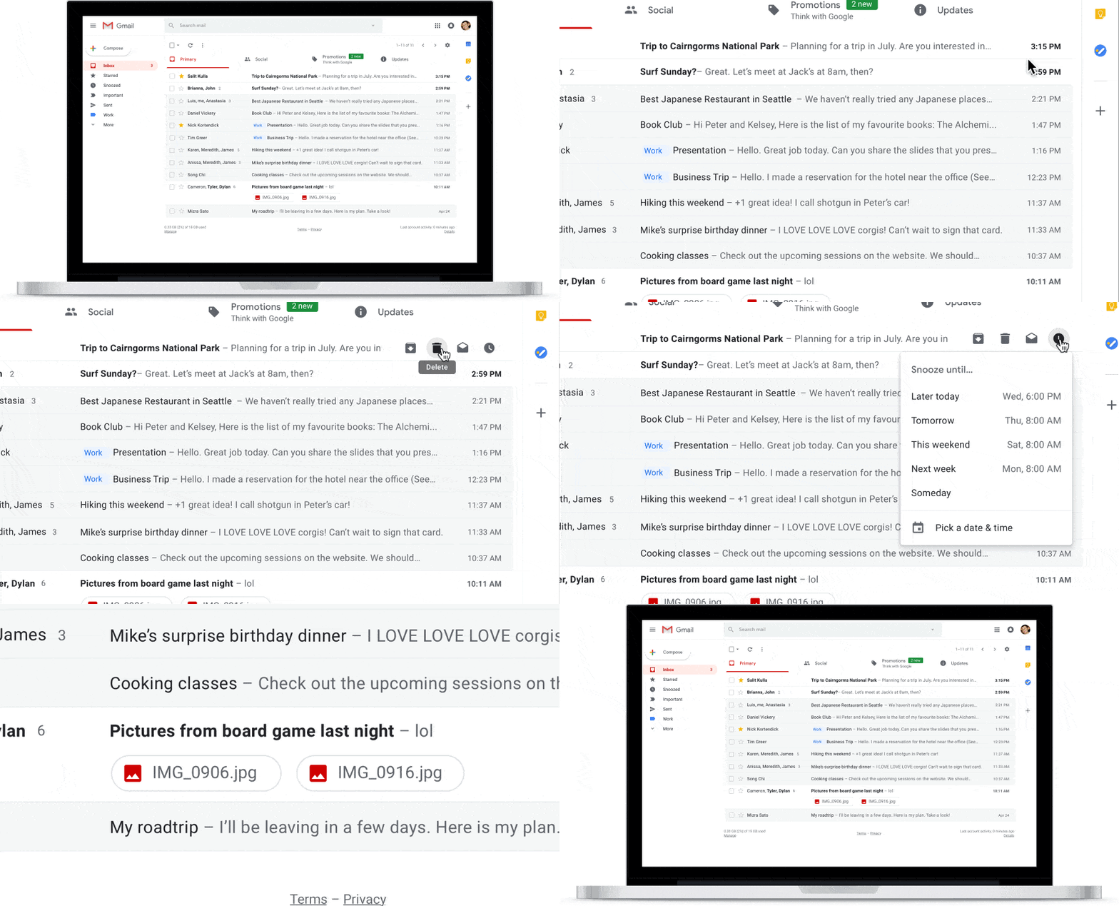
Ok, apart from the much-needed makeover the new Gmail is absolutely awesome. A lot has been said about the snooze feature which is certainly very handy: if you think an email can wait, you just snooze it for a later date (think of it as a reminder).
The other important feature is the “expiry date” you can set on an email. After this date, the recipient cannot access it anymore (very useful for private messages or messages that are no longer needed after a specific date). However, the three features below really stand out for me and their importance hasn’t been stressed enough.

Sidebar: Tasks, Calendar, Keep
A sidebar is crucial because when writing a message you need to be able to have your calendar open next to it so you can schedule your meetings and important dates. No need to open a separate calendar window and waste time or lose track of what you were about to say.
Your tasks and to-dos are also presented next to your messages so you can easily organise your day. Same for your Keep notes. Let’s say you’re running some errands outside and you take a picture of an item or note down an important address in Google Keep, something you need to email later on. When you sit down to write that email, your Google Keep notes are right next to you. How handy is that?
Visible attachments in your Inbox
This is true! You no longer need to open each different email individually to check if the file you’re looking for is there. Now attachments can be displayed under the title of the email in your Inbox. Just click on them and they are instantly downloaded on your hard drive. A time saver? Definitely. It makes you wonder why on earth this hadn’t been there in the first place!
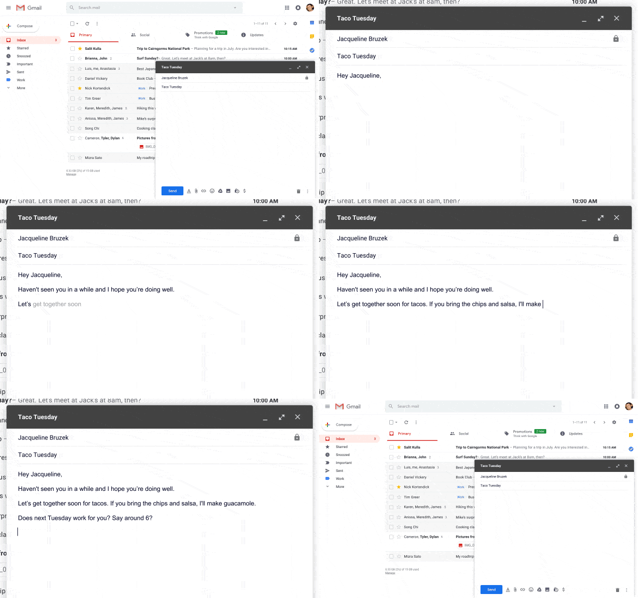
AI in your email: Smart compose
This is the latest feature (you can enable it by going to the new Gmail settings and enable “Experimental access” in the General tab). What it basically does is auto-complete your sentences with suggestions as shown below. Neat!

Should I switch from Outlook.com?
It depends. The classic folder-structure of Outlook.com seems to resemble more they typical business email clients. The interface might still look a bit cleaner for paid customers, but for free uses the big ads on the right-hand side of the screen are distracting. Outlook.com does have a wonderful Sweep function that can immediately get rid of emails with the same title or content. But then again, the improved Gmail functionality is hard to beat: who doesn’t want to have access to their calendar, important notes and tasks right next to them while composing a new message? Along, with the visible attachments right in your Inbox, the new Gmail could be a winner, saving you lots of valuable time.

Leave a Reply